Perdoo
Introduction
Perdoo software helps businesses thrive in today’s dynamic environment by helping them successfully bridge the gap between strategy & execution through clear, measurable OKRs — objectives and key results.
A core element of their product is the Team Profile page. This is where every team member can see the team OKRs, as well as some basic info about the team and some stats. It is typically used in meetings together with the entire team, to check in on how things are going in general, and ascertain to a comfortable degree of certainty what areas require more attention.
Design Goals
As part of an exercise, I was given some data on a section of their product, as well as the brand style guide, and asked to have a go at the following:
Add KPI functionality
Redesign Team page to show the team’s KPIs in addition to its OKRs, featuring a maximum of 4 indicators. KPIs are not inside a timeframe, so they should not change when a user selects a different timeframe from the dropdown.
Make UI elements more intuitive
From several UX tests and user interviews, the Perdoo team found that the functionality of the dropdowns (particularly the “review” dropdown) is often unclear until users try it for the first time. Ideally, they wanted usage of Perdoo to be intuitive, which meant that features should be as obvious as possible.
Solutions
Research
- From some brief research into the relationship between OKR and KPI, I was able to see that:
- For each OKR, there is an Objective to be achieved, along with a set of metrics that will measure the achievement of that Objective, called Key Results. KPIs or “Key Performance Indicators” represents factors needed to achieve success in an organisation. They measure processes or activities already in place.
- KPIs or “Key Performance Indicators” represents factors needed to achieve success in an organisation. They measure processes or activities already in place.
These definitions further reinforced the fact that, unlike OKRs KPIs are more static, so to speak, especially over time. And so I had to keep this in front of my mind while working.
Sketches
I used Invision’s nifty tool, Freehand, to make sketches of different configurations and layout changes.

Wireframing
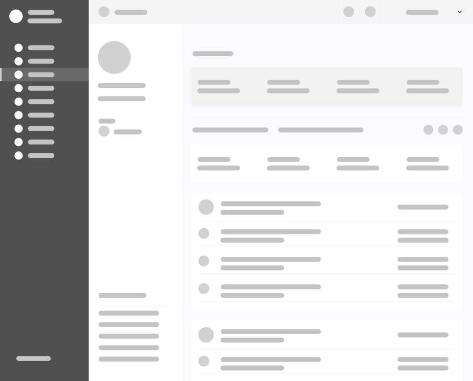
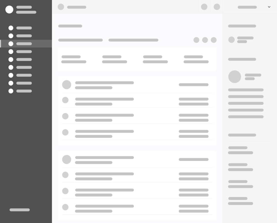
After running through the multiple solutions I had expressed on Freehand, one of which included converting the dropdown filter to a radio filter, I decided on two which I believed were the strongest solutions, and fleshed them out some more.
High Fidelity Mockups
While possible solutions were quite a few, based on the given constraints, I had to settle on the two I felt were the strongest. I chose to use Adobe XD for my execution, so I proceeded to export relevant assets from the original Sketch file and rebuild the layout in XD.
SOLUTION 1
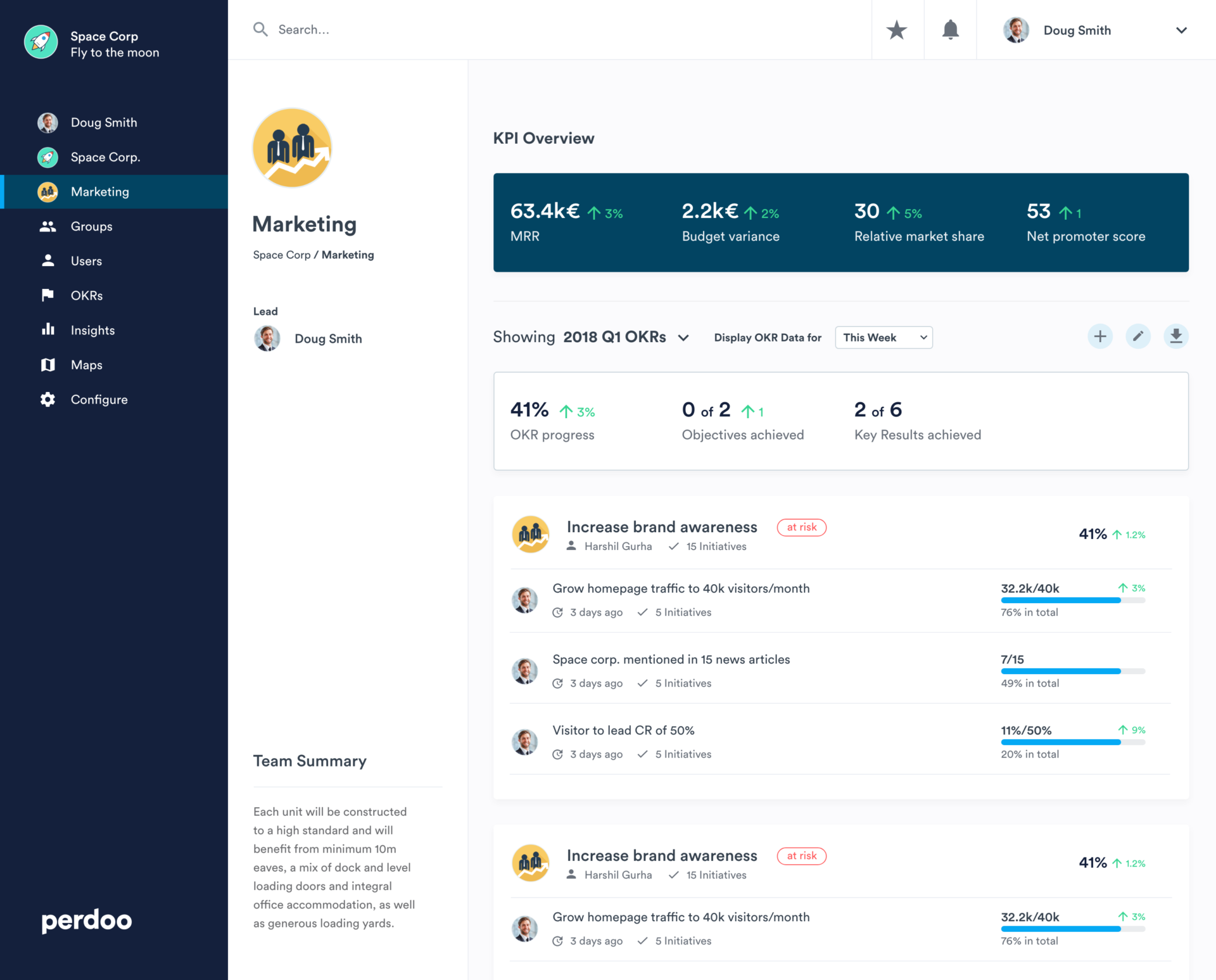
The crux of this solution was adding an additional bar for the KPIs above the rest of the OKR filters and data, as well as using another colour (from the Perdoo colour palette provided) to clearly differentiate it from the rest of the other cards below, especially since the timeframe filters are not supposed to affect the KPIs. I also raised the font size of the page title to properly establish typographical hierarchy on the layout, and I gave the sidebar holding it a background colour to demarcate it properly from the rest of the data.
For the drop-down filters, I chose to update the messaging in order to make the function clearer to the users; essentially, I explicitly defined the functions of the filters. I also moved the sub-filter dropdown closer to the main filter, making their relationship clearer by using proximity.
Because this is a Team page, and I had some space to spare, I felt I could add a Team Summary section to further highlight what the teams goals and motivations are in prose, so the data being presented becomes even more relatable to its members. I also added breadcrumbs to the sidebar.
Other less obvious updates included minor optimisation with regard to the spacing between elements on the cards to make the layout cleaner and the view easier to use.
- Pros:
- Establishes hierarchical distinction between KPIs and OKRs by having the KPI card in a different colour and above the OKRs, as opposed to letting the KPI card break the connection between the OKR summary and the individual Objectives, Initiatives and Key Results.
- Does not significantly consume additional real estate.
- With adjusted messaging and position, the dropdown filter functionality and context is made clearer to the prospective user.
- Cons:
- KPIs, like the OKRs, are rendered invisible once page is scrolled out of the viewport.
- Even though messaging is adjusted, there is still some ambiguity as to whether the filters affect the KPIs as well as the OKRs.
SOLUTION 2
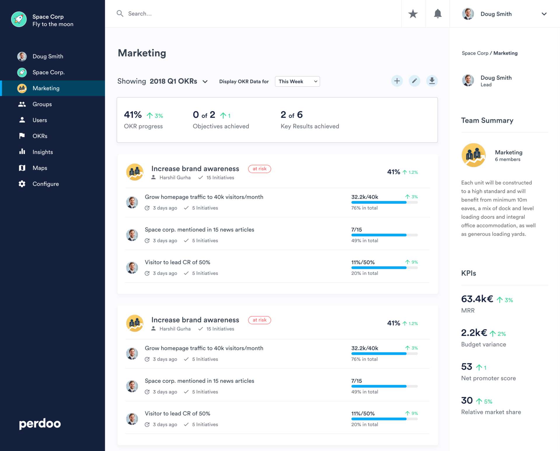
For this, I decided to take more liberties with moving elements around to further isolate the KPI data. Still maintaining the sidebar, I flipped the layout horizontally, switching its position with that of the main body, and added the KPI data to the sidebar as opposed to an additional card. This ensures that the data is always visible on large devices — an edge over the first solution, in my opinion, because KPIs help monitor performance and identify problems and areas for improvement, and so it makes sense that they are always visible on the team’s page.
I also maintained the increased font size of the page title to properly establish typographical hierarchy on the layout, but I moved the team’s avatar and Team Lead details to the sidebar as well to give the title space to stand out properly, and allow for consistency across other pages that might not have an image to go with the title.
In addition to maintaining the Team Summary concept, I added the number of team members as well on this iteration so the team’s strength could be viewed at a glance.
Again, I maintained the changes made with regard to improving the spacing between elements on the cards to make the layout cleaner and the view easier to use.
- Pros:
- KPIs are always visible, regardless of scroll position.
- Does not significantly consume additional real estate.
- By adjusting the messaging of the dropdown filters, as well as clearly isolating the KPI data from the rest of the scroll view, there is less ambiguity with regard to what they control.
- Extra team information can be added to sidebar.
- Cons:
- Might affect page layout across the app based on the need for consistency.
- KPI data not immediately visible on mobile devices
Mobile Considerations
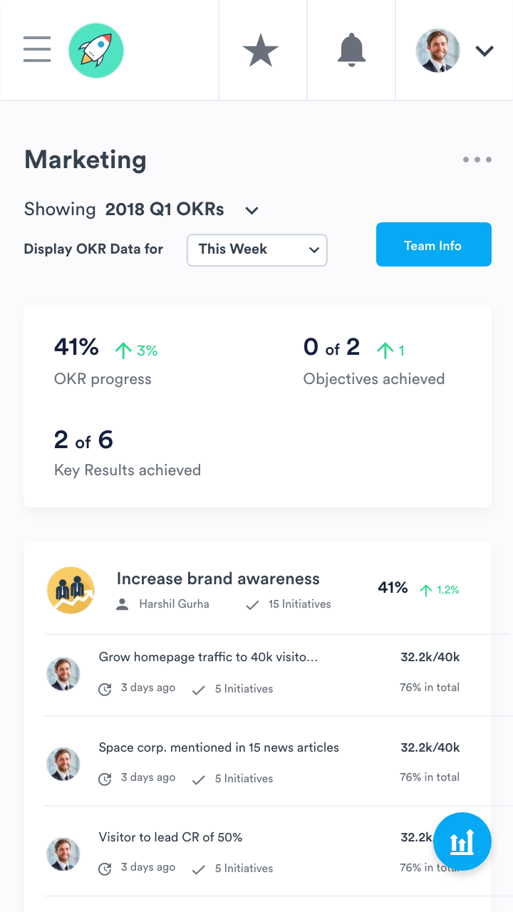
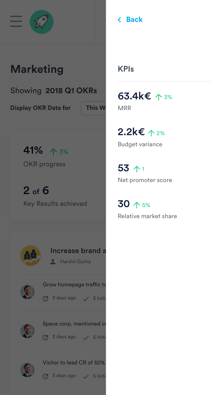
For mobile devices, I believe a Side Panel or a modal can be used in both cases to reveal and dismiss the sidebar content including team info and KPI, so it is more quickly accessible as opposed to having to scroll to the bottom of the page to see it. It might look something like this:
Considering the reduced available real estate, iconography is employed here to depict KPIs, and a static, floating button that is always visible even on scroll is employed to make sure that no matter where you choose to display it, the KPI data is easily accessible at any time.
-
Final Observations
- In reality, elements/ideas from either solution could probably be mixed and matched to form an even more robust solution, eg adding a coloured background to the sidebar-positioned KPI stack. I only tried to cover as many approaches as possible within two final solutions.
- If PDF is the only format that can be exported from the page, then the icon could be updated to become clearer; however, if other formats can be extracted now or in the future, then the icon is fine and can remain the same.
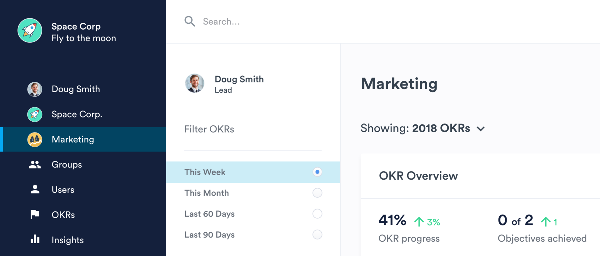
- While the dropdown filter should work just fine with better messaging, I think A/B testing can be done regarding the radio filter option to see which approach makes more sense to Perdoo users, especially with respect to seamlessly filtering the OKR results. The filter (if implemented) would be on the sidebar, and may look like this:
