GLAM
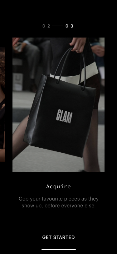
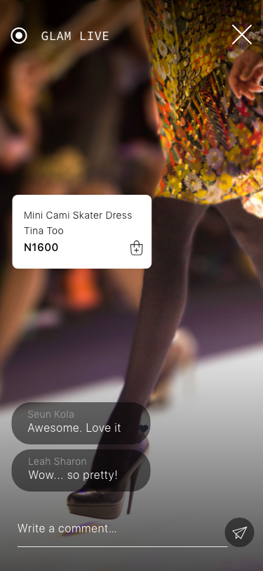
An avant-garde online commerce experience that curates fashion designers and their beautifully crafted work in front of customers when it really matters, and then afterwards — further enabling existing activities and conversations within the burgeoning space.
Problem Definition
By the time designs showcased during fashion weeks and events make their way into stores, knock-off versions would have been selling like hotcakes wherever they may be found, meaning less interest and fewer sales for designers. Fortuitously, while events were once a chance for press to preview collections, digital media has turned it into a full-on content marketing opportunity.
Enter GLAM, a simple platform that takes advantage of this phenomenon, enabling fashion designers and event organisers publish relevant content and get discovered in real time for fashion buyers and aficionados alike.
While events were once a chance for press to preview collections, digital media has turned it into a full-on content marketing opportunity.
User Research
As already established, events are an effective way for brands to showcase their products, using social media to both tell stories and derive insights from their audiences. GLAM’s aim is to leverage this pertinent fact…but first, the major user personas need to be clearly defined.
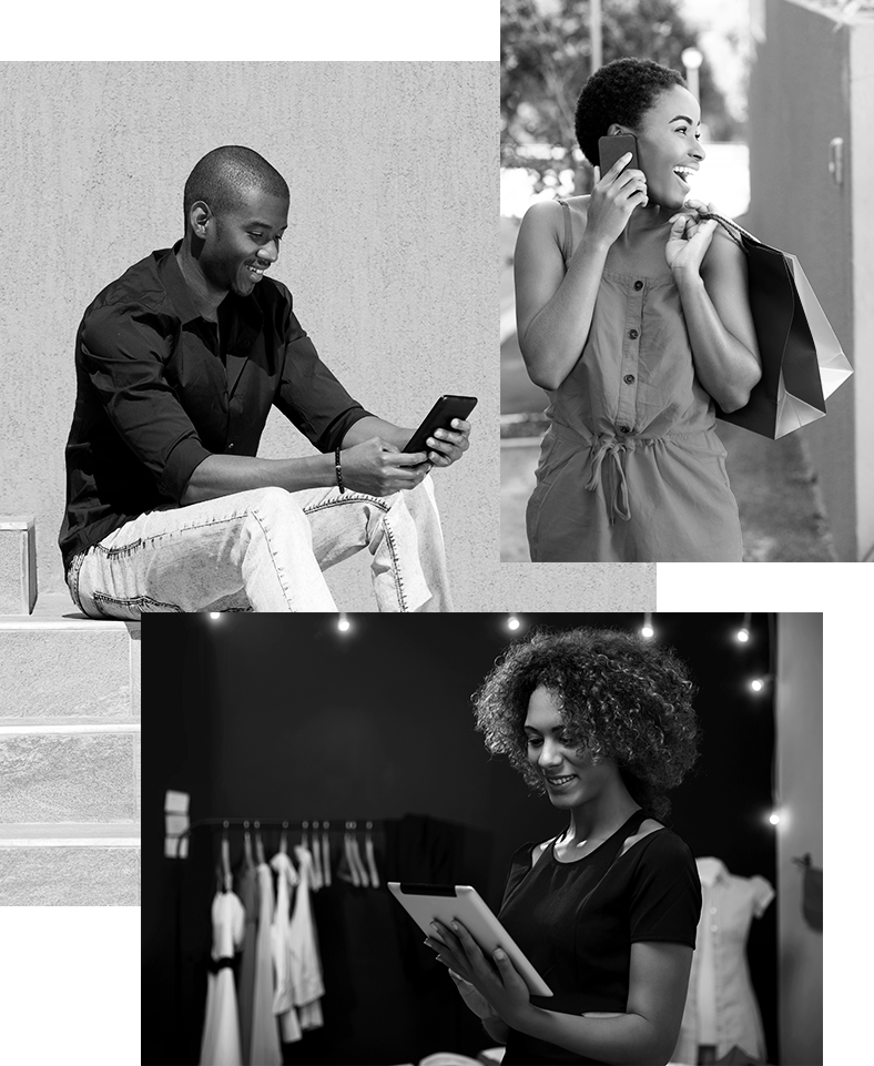
From carrying out some semi-structured interviews in tandem with online research, I was able to ascertain that GLAM’s users live primarily online; they keep abreast with everything that goes on in the fashion and entertainment scene using their mobile phones, and they span from those that might not be able to afford to attend the shows the gliteratti grace, to the industry veterans and influencers that come to discover new talent and merchandise to stock.
The Creator
Unisex. 21 – 45 years old. Designer / Writer. Building a budding brand, but with no dedicated online storefront / presence save Instagram profiles. Wants to be seen by potential customers, and network with and/or get inspiration from fellow designers/writers.
The Explorer
Female. 25 years old. She’s super social, works a corporate job but is a huge weekend warrior and really lets he personality and quirkiness shine. She’s generally just looking at different clothing stores and doing online window shopping. Looking for inspiration.
The Fan
Female. 21 years old. Ayo is a big fan she resonates with her idols and follows them on Snapchat, Instagram and Youtube. She doesn’t have huge disposable incomes but saves up the money from her part time job to invest in some of key pieces each season.
The Collector
Unisex. 30 – 65 years old. Looking for specific products & deals and knows exactly what they are looking for. Aficionados, they are at all the events, festivals and exhibitions that matter, and they live in the moment.
Epics + Stories
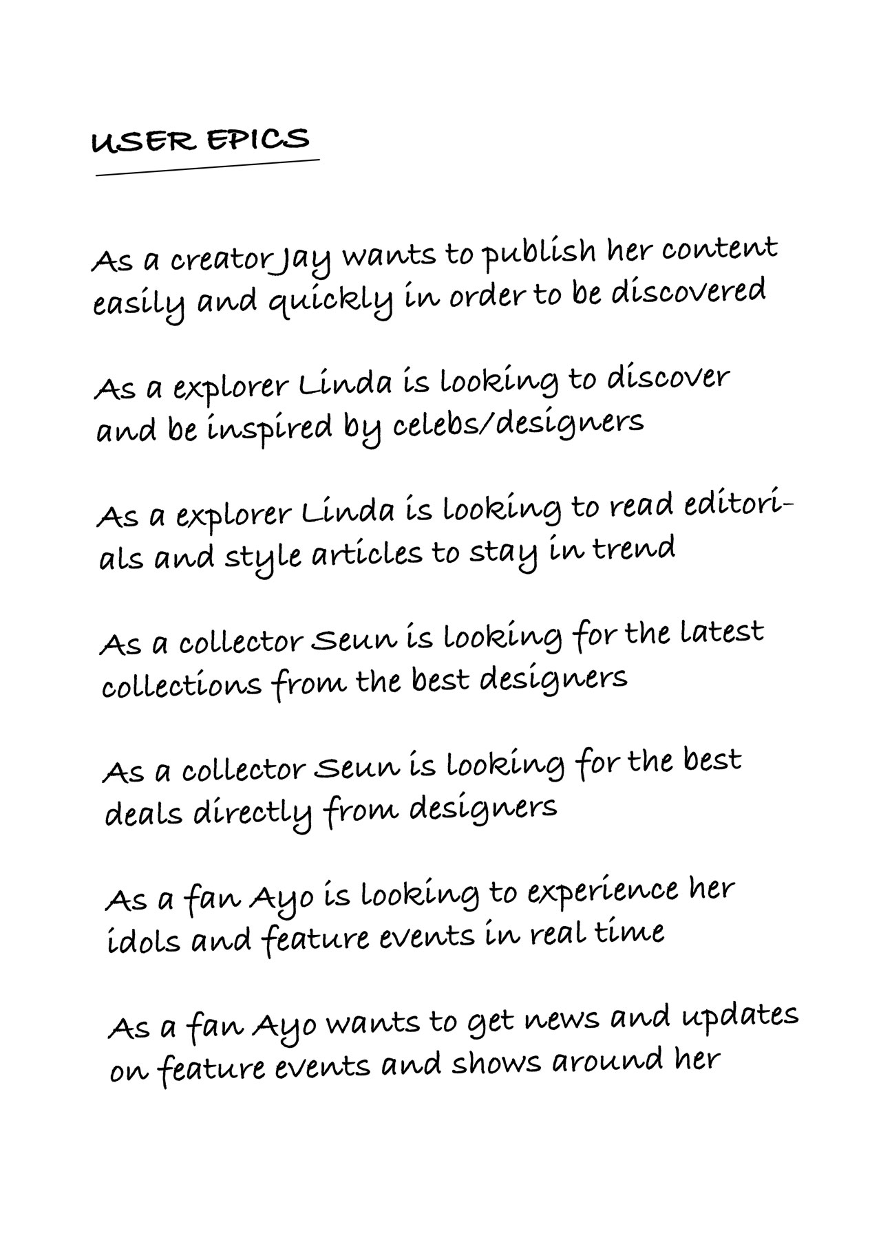
For the MVP, I had to breakdown to first principles what the core function of the app would be, and the features that would make all that possible. Firstly, I proceeded to attempt defining primary epics for the personas earlier specified. These guided me in ascertaining what the individual features would be by way of smaller user stories that essentially helped me map out multiple user journeys from discovery to action. The guiding principle in all this was imagining how my targeted users should feel after each experience — informed, inspired and ultimately, satisfied. To this end, I opted to focus on an overall design direction that would push this through.
Design Principles
Minimalistic, to highlight the actual content and not the container; Personable/Human, so each persona could relate; Curated, or to have the feel of a catalog of experiences; Lifestyle/Consumer-driven, anchored on or influenced by the actions and needs of the consumers; Simple yet sophisticated, in terms of look and feel.
Wireframes + Flowmap
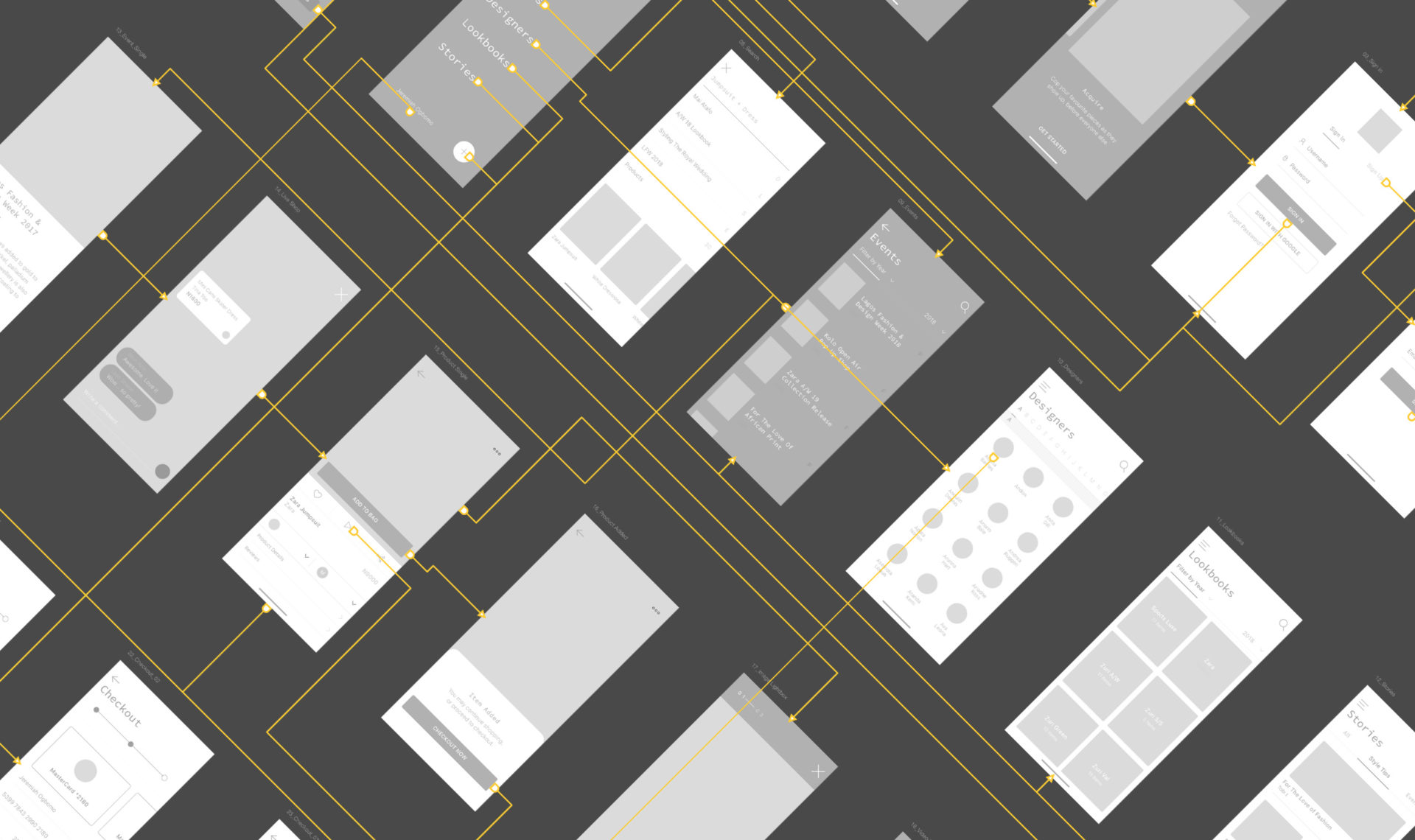
I used Invision’s Freehand to make sketches and wireframes of different configurations and iterate through layout changes, simultaneously getting immediate feedback from friends that somewhat fit the defined personas. When I was relatively satisfied, I headed to Overflow to try as much as possible to map out the primary user flows.

Style Guide + Screen Design
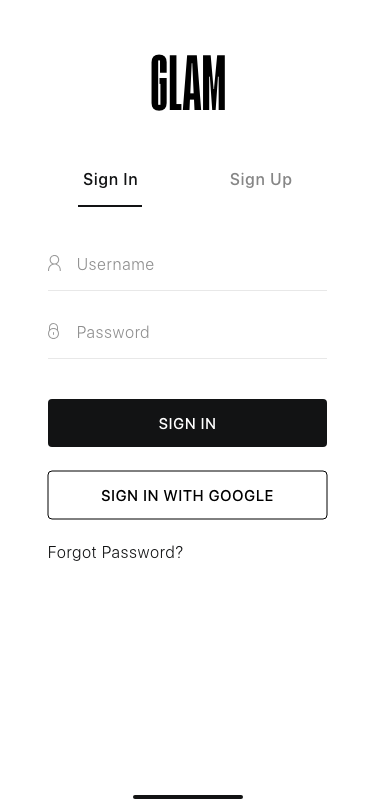
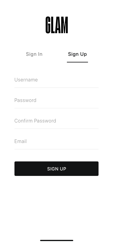
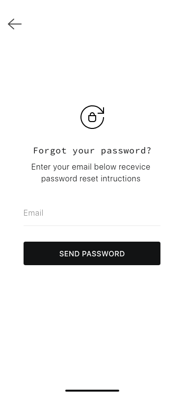
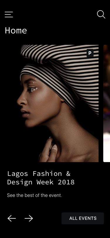
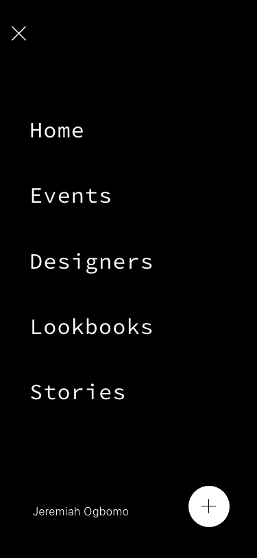
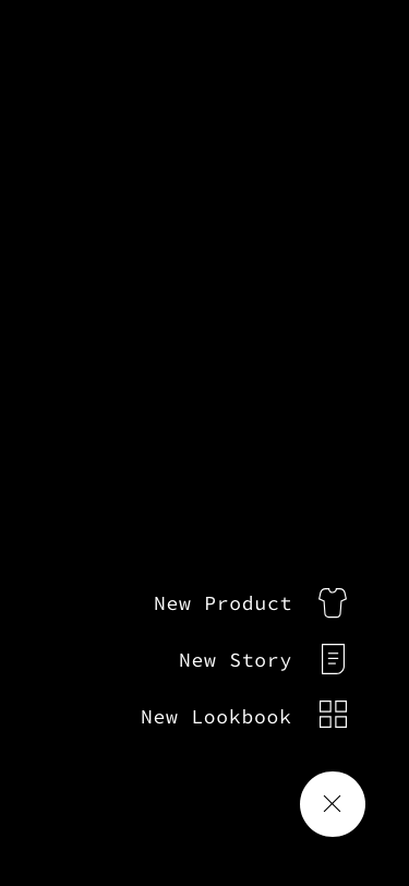
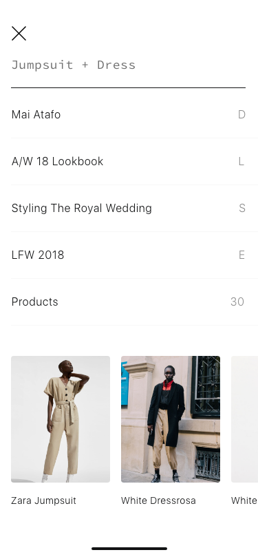
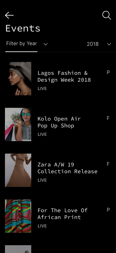
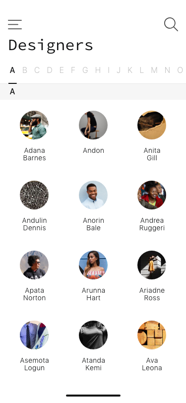
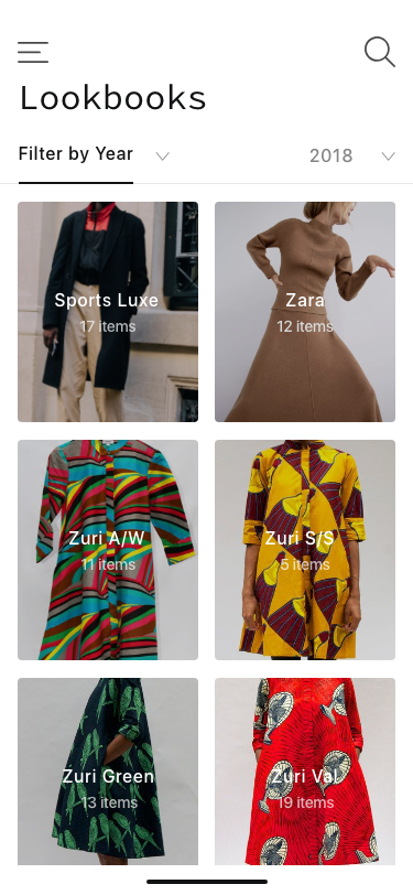
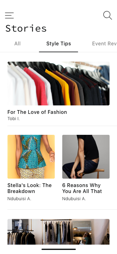
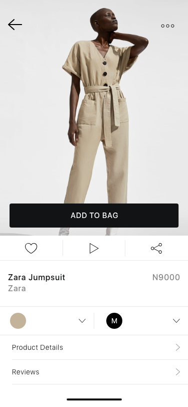
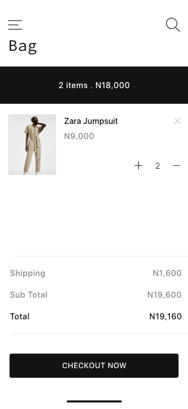
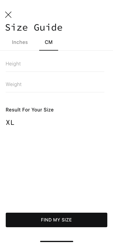
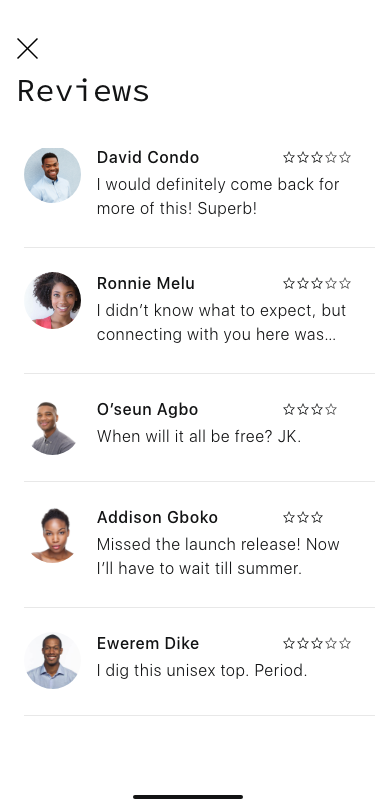
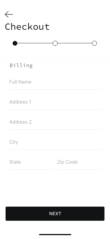
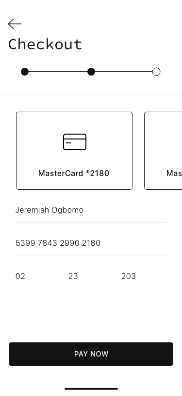
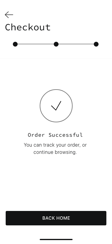
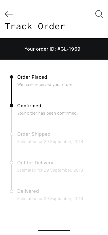
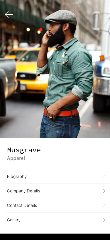
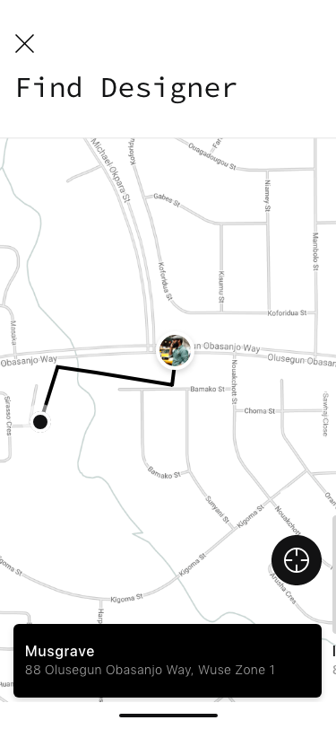
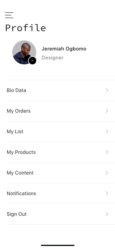
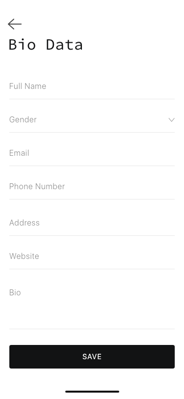
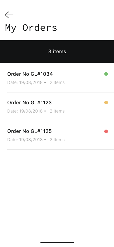
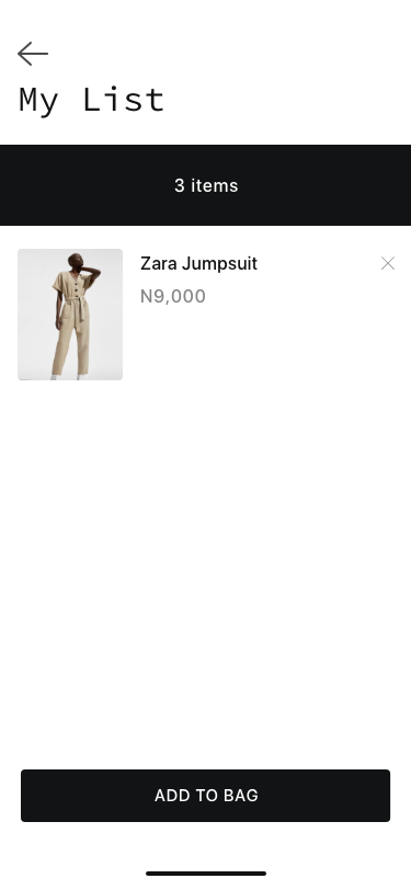
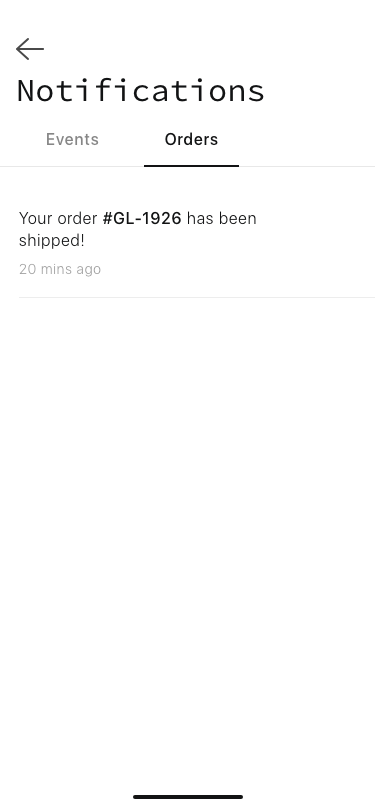
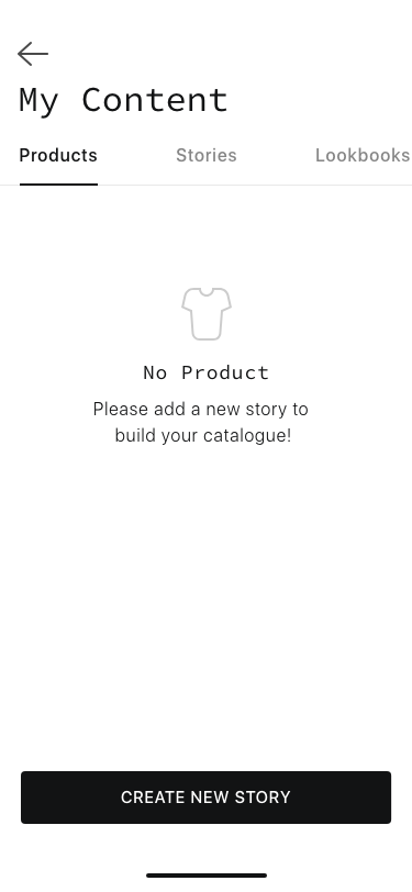
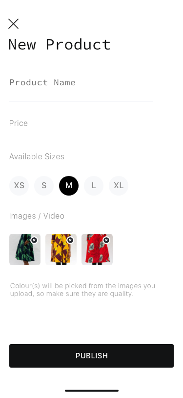
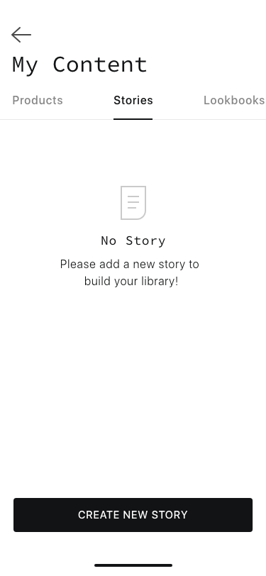
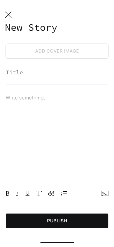
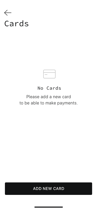
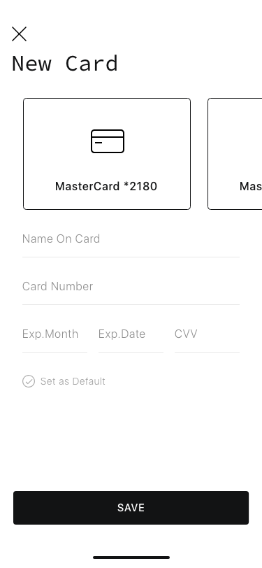
Based on the minimal design direction I had chosen earlier, I defined a style guide that fit with the overall vision, from typography to the icon set. I then proceeded to flesh out the screens in high fidelity on Adobe XD, creating symbols for re-usable components along the way. Colour scheme was kept at simple monochrome — black, white, grey — for two major reasons: to give the app a luxurious finish, and to enable the actual content stand out as much as possible.


In Conclusion
Test. Re-iterate. Repeat
I’ve continued to conduct usability tests with potential users using a native prototype built using Flutter. While the feedback has been quite encouraging and instructive so far, to improve on the scale of testing and obtain even more inclusive results, I’m considering using Maze.Design and/or UsabilityHub, since they both offer access to real users and useful tools. I’m using my findings to further iterate upon the design, and keep making the product better. The possibilities are endless.
Final Thoughts
Going through this whole process of user-centered design further convinced me on the need to design digital products with the user in mind at all stages and phases, especially when venturing into relatively new fields that do not have as much data available to glean from. It was interesting gathering information using different methods. I’m also doing preliminary work on a web dashboard to further aid content creation and management on the platform, as well as give valuable insights to stakeholders. After all, the journey never ends, does it?

